

My first client of the new year came to me with one of my favorite requests... a brand update. These are my favorite types of projects to work on. It's always a joy to see where a business, or organization has been, and to be a part of helping them take the next step.
Most of the time I find that there is some history there, and I always try to take that into consideration before I move forward. This often doesn't allow for full creative, which I find to be even more challenging. You see, with an existing brand there are usually pre-existing parameters, a definite arena in which I have to work. This limitation is truly challenging, but in many ways it forces you to be even more creative with the graphic solution.
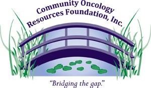
In the case of the Community Oncology Resources Foundation there was already a logo and slogan in place, but neither had seen enough placement to be considered solid identifiers for the non-profit foundation.
After an initial phone conversation, my client and I decided to meet and discuss the brand update over coffee. It was a great meeting I discovered many things about C.O.R.F. that helped me determine a direction to take for the new mark.
We decided that the bridge would still make a solid icon for C.O.R.F., but with a more streamlined design. I also felt that it was important to not only write out the slogan, but to somehow symbolize it in the new mark.
I sketched out a few thumbnails with my client, and she liked the direction I was going. I felt confident that we were on the same page, so I went about designing the new Community Oncology Resources Foundation logo.


I experimented with several layouts and color options, but in the end I felt that it was a good idea to stick with purple and green for the brand palette, although I did move the dial away from the exact colors in the original logo.
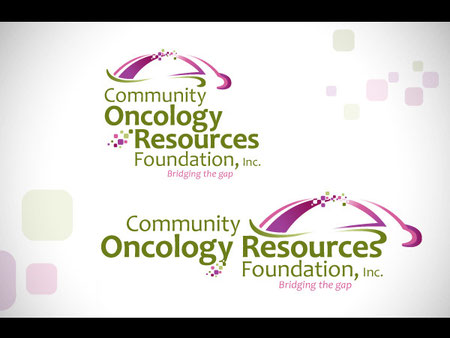
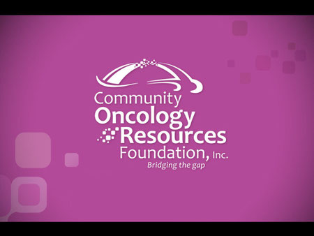
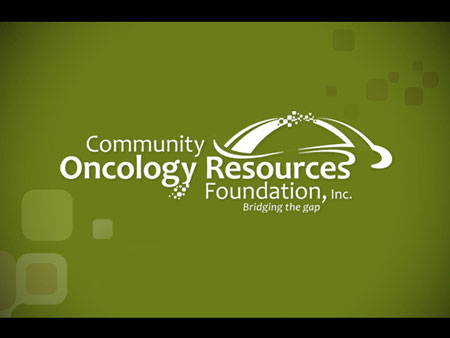
Like most of my logo projects, I created a horizontal and stacked version, as well as full and single color version to make certain that the mark would be versatile.
Along with the logo proofs, I included several style sheets which better illustrate the new mark in use. This is something I've been doing for quiet a while, and seems to be standard with creative companies outside of the Southwest Louisiana market. I'm not certain why we don't see much of this in our area, but I find that my clients appreciate the perspective the styles sheets provide.


This particular project proved to be a bullseye. I sent the proofs out and my client loved the design. I can't say that this happened because I am a particularly good designer. I believe this sort of thing happens because I'm a good listener, and I truly try to give my client what they need to do the job. While I think of myself as a creative person, I don't let creativity get in the way of doing what is best for my client's brand.
There really is nothing better than seeing a satisfied client put their logo in play. I always get a sense of pride and joy as they move forward. A new logo can be just the right fuel to get a brand motivated, and push it into action.
A new logo also lets you get started with a brand on the ground floor, and allows you to build a positive creative relationship with your client from the very beginning. This has been the case for me with the Community Oncology Resources Foundation, and I'm really thrilled to be helping them take their first serious steps as a brand.