
Strategic Logo Design Weaves Faith, Heritage, and Community Into a Unified Visual Identity

Parker Brand Creative Services recently developed a custom logo and brand identity for Harvest Church, a Louisiana congregation seeking a visual mark that would reflect not only its beliefs, but also its history, community, and connection to the land.
The project challenged our team to create a logo that communicated multiple layers of meaning while remaining simple, memorable, and approachable.
Through strategic branding, symbolic design, illustration, and visual storytelling, the resulting identity brings together faith, agriculture, scripture, communion, and the natural landscape into a single cohesive mark.
Designing a Logo with Purpose
The strongest logos do more than identify an organization. They communicate values, tell stories, and create emotional connections. For Harvest Church, the design brief included several important requests:
- Represent the church's commitment to Scripture
- Incorporate a reference to communion
- Symbolize the Holy Spirit
- Reflect the Holy Trinity
- Honor the property's history as a Louisiana rice field
Rather than relying on obvious or overused religious imagery, Parker Brand focused on creating a logo that would reveal deeper meaning over time while remaining visually clean and accessible.
The goal was to develop a mark that could serve the church for many years while encouraging thoughtful discovery.
Finding Meaning in Every Element
The design process centered on weaving multiple concepts into a unified visual system. Each element was intentionally crafted to contribute to the story.
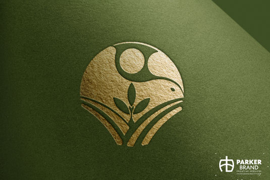
The cultivated field rows reference the site's agricultural heritage while simultaneously suggesting the pages of an open Bible.
A central rice stalk was designed to form the shape of a communion chalice, creating a subtle connection to one of the church's core practices. Three grains emerging from the stalk symbolize the Holy Trinity.
Above the landscape, the horizon line, sky, and flowing cloud forms work together to create the impression of a dove, representing the Holy Spirit.
The result is a layered identity that rewards closer observation while maintaining clarity and simplicity at first glance.
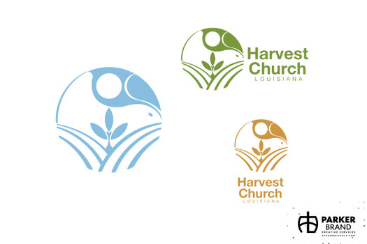
Creating a Color Palette Rooted in Place
Color played an important role in reinforcing the story behind the brand.
The palette draws inspiration from:
- Louisiana Rice Fields
- Agricultural Harvests
- Fresh Spring Growth
- Southern Landscapes
- Open Blue Skies
These choices help connect the visual identity to both the church's location and the themes of growth, renewal, and faith that are central to its mission.
Strategic Branding Beyond Aesthetics
While the logo appears simple, the project demonstrates the value of strategic branding and creative problem solving.
Every shape, proportion, and relationship was carefully considered to ensure the final mark would function effectively across a wide range of applications, including:
- Church Signage
- Printed Materials
- Digital Communications
- Social Media
- Promotional Products
- Apparel
- Facility Branding
- Worship Resources
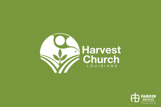
The resulting identity is versatile, scalable, and designed for long-term use.
Creative Services Provided
For this project, Parker Brand Creative Services provided:
- Logo Design
- Brand Identity Development
- Church Branding
- Strategic Branding
- Visual Storytelling
- Symbolic Illustration
- Custom Icon Design
- Color Palette Development
- Creative Direction
- Production-Ready Artwork
- Brand Implementation Support
Helping Organizations Tell Their Stories
Every organization has a story worth telling.
The challenge is communicating that story in a way that is clear, memorable, and meaningful.
Projects like Harvest Church demonstrate how thoughtful branding can transform complex ideas into simple visual communication, helping organizations express who they are and what they value through design.
The result is more than a logo.
It is a visual expression of identity, belief, history, and purpose.

Michelle Parker, Brand Builder
Parker Brand Creative Services
Michelle Parker is the Art Director and co-owner of Parker Brand Creative Services, where she helps businesses bring their brands to life through thoughtful design and strategic creative solutions. With a career spanning decades, Michelle has built a reputation for creating meaningful, effective visual communications that help organizations connect with their audiences and strengthen their brands.
Parker Brand Creative Services is a Louisiana-based marketing, advertising, branding, graphic design, illustration, signage, photography, videography, media strategy, and creative communications firm. The agency specializes in logo design, brand development, publication design, municipal branding, tourism marketing, environmental graphics, custom cartography, wayfinding systems, and strategic creative solutions that help organizations connect with their audiences and strengthen their communities. To learn more about Parker Brand Creative Services, visit ParkerBrandUp.com.
Write a comment